Components
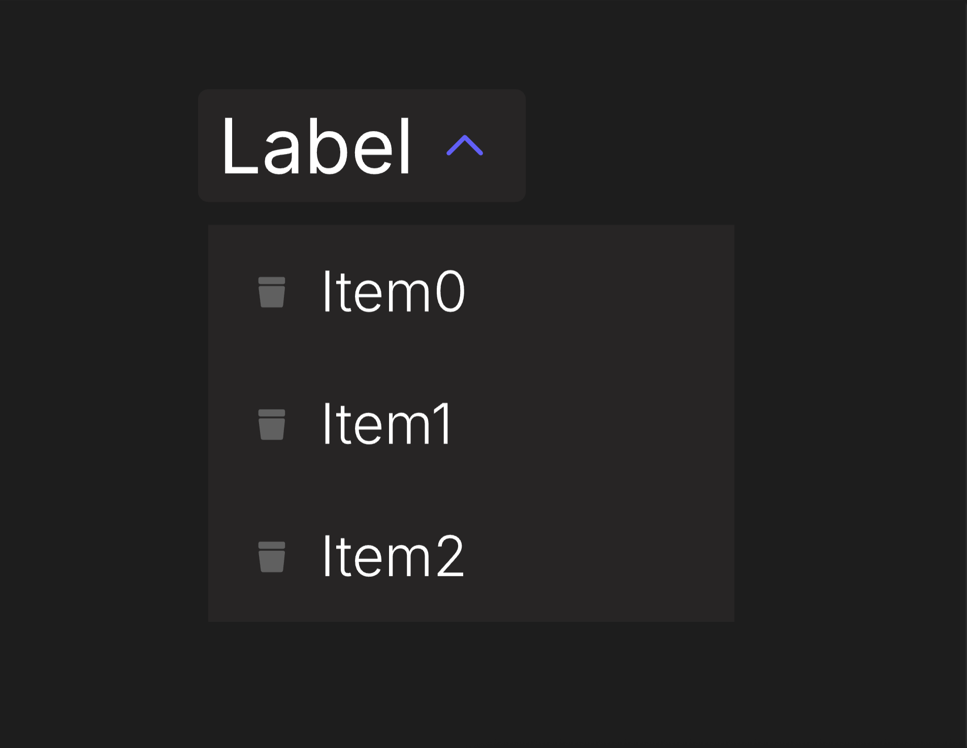
Dropdown Menu
An accessible dropdown and context menu that is used to display a list of actions or options that a user can choose.
Viewmodels
DropdownMenuVM
loopItemsbooleanDetermines whether selectedItemIndex loops to first item or clamps when it reaches the bounds.
usePointerbooleanDetermines whether the Dropdown Menu is driven by pointer input or not.
selectedItemIndexnumberThe index of the currently selected option in the Select.
itemCountnumberThe total number of items in options.
optionslistContains a list of all available options in the Select.
controlArtboardartboardDetermines which artboard is used to visualize the component's state.
labelArtboardartboardDetermines which component is used for the Label.
labelstringSpecifies the localized strings that identifies the Dropdown Menu.
expandedbooleanDetermines whether the Dropdown Menu has been expanded.
disabledbooleanDetermines whether the component is disabled.
hoverbooleanIndicates when the pointer overlaps with the Dropdown Menu.
directionEnumDetermines the Dropdown Menu's left-to-right alignment.
DropdownMenuOptionVM
controlArtboardartboardDetermines which artboard is used to visualize the item's state.
iconArtboardartboardDetermines which artboard is used to visualize the item's icon.
listIndexnumberThe index of the item.
itemPressedtriggerFires when the option has been chosen.
labelstringSpecifies the localized strings that identifies the option.
disabledbooleanIndicates when the option is disabled.
hoverbooleanIndicates when the pointer overlaps with the Select.
Hierarchical Structure
dropdown_menu_component
- Root - The Root of the component.
- TopRow - A Layout containing label and control of the component. Pointer functionality targets this Layout.
- Label - A Layout containing the Label Artboard.
- A component instance of labelArtboard.
- Control - A Layout containing the Control Artboard.
- A component instance of controlArtboard (DropdownMenuVM).
- Label - A Layout containing the Label Artboard.
- Options - A Layout containing the Dropdown Menu's options.
- An Artboard List of options. The artboard in use is option_item.
- TopRow - A Layout containing label and control of the component. Pointer functionality targets this Layout.
- IndexManager - A script that manages selectedItemIndex. If (loopItems = true), selectedItemIndex will loop around once it goes beyond the range of itemCount. If (loopItems = false), selectedItemIndex will be clamped within the bounds of itemCount. In the event that one of the items in options is disabled, selectedItemIndex will skip to the next item.
Animations
This artboard contains a pair of animations used in a corresponding state machine layer.
- Expanded
- ExpandedTrue - Sets the visibility of Body to "Show." Plays if (expanded = true) and (disabled = false).
- ExpandedFalse - Sets the visibility of Body to "Hide." Plays if (expanded = false).
arrow_control
- Root - The Root of the component.
- A group containing a shape. This prevents the shape from being distorted by its parent layout.
- A shape representing an arrow.
- A group containing a shape. This prevents the shape from being distorted by its parent layout.
Animations
This component contains three pairs of animations, each on its corresponding layer.
- Disabled
- DisabledTrue - Indicates the Dropdown Menu cannot be interacted with. Plays if (disabled = true).
- DisabledFalse - Indicates the Dropdown Menu can be interacted with. Plays if (disabled = false).
- Hover
- HoverTrue - Indicates the pointer overlaps with the Dropdown Menu. Plays if (hover = true) and (disabled = false).
- HoverFalse - Indicates the pointer does not overlap with the Dropdown Menu. Plays if (hover = false).
- Expanded
- ExpandedTrue - Indicates the Dropdown Menu has been expanded. Plays if (expanded = true) and (disabled = false).
- ExpandedFalse - Indicates the Dropdown Menu has not been expanded. Plays if (expanded = false).
text_label
- Root - The Root of the component.
- Text Layout - A Layout containing a Text Element.
- Text - A text element. The value of its Text Run is bound to label (DropdownMenuVM).
- Text Layout - A Layout containing a Text Element.
option_item
- Root - The Root of the component. Pointer functionality targets this Layout.
- A component instance of controlArtboard (DropdownMenuOptionVM).
option_control
- Root - The Root of the component.
- Icon - A Layout containing the Icon Artboard.
- A component instance of iconArtboard.
- Label - A Layout containing the option's Label.
- Text Layout - A Layout containing a Text Element.
- Text - A text element. The value of its Text Run is bound to label (DropdownMenuOptionVM).
- Text Layout - A Layout containing a Text Element.
- Icon - A Layout containing the Icon Artboard.
Animations
This component contains two pairs of animations, each on its corresponding layer.
- SelectedIndex
- SelectedIndexTrue - Indicates the option has been selected. It will play under two conditions:
- (selectedItemIndex = listIndex) and (usePointer = false).
- (hover (DropdownMenuOptionVM) = true) and (usePointer = true).
- SelectedIndexFalse - Indicates the option has not been selected. It will play under two conditions:
- (selectedItemIndex ≠ listIndex) and (usePointer = false).
- (hover (DropdownMenuOptionVM) = false) and (usePointer = true).
- SelectedIndexTrue - Indicates the option has been selected. It will play under two conditions:
- Disabled
- DisabledTrue - Indicates the option cannot be interacted with. Plays if (disabled (DropdownMenuOptionVM) = true).
- DisabledFalse - Indicates the option can be interacted with. Plays if (disabled (DropdownMenuOptionVM) = false).
Best Practices
- If using this component on a platform without pointer input, you can increment or decrement selectedItemIndex to navigate between options. IndexManager was created to account for this use case.
- selectedItemIndex and hover share animations on this component, as they serve similar functions depending on the platform. If using this component on a platform without pointer input, usePointer should be set to false. Alternatively, in the event you use both, you can create separate animations for them.