


Components
Drawer
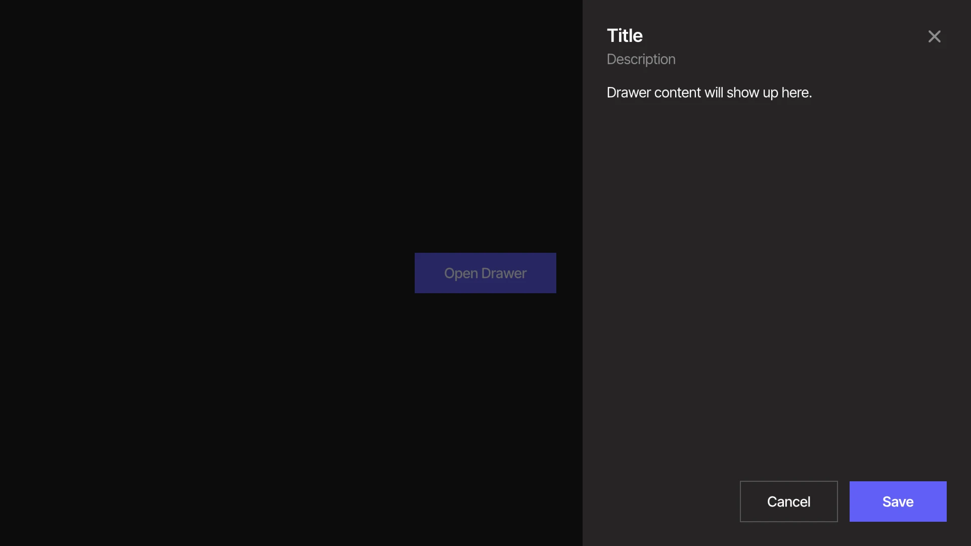
A panel that slides in from an edge of the screen to show additional content.
Viewmodels
DrawerVM
contentArtboardartboardDetermines which artboard is used to visualize the drawer's contents.
closeArtboardartboardDetermines which artboard is used to visualize the close button.
openbooleanIndicates when the drawer is open.
placementEnumDetermines which edge of the screen the drawer slides in from. The options are Start, End, Top and Bottom.
sizenumberThe width (Start and End) or height (Top and Bottom) of the drawer. It is clamped to the size of the screen, so a very large value makes the drawer fill it.
closeOnInteractOutsidebooleanDetermines whether pressing outside the drawer closes it.
labelstringSpecifies the localized strings that identifies the component.
titlestringSpecifies the localized strings for the drawer's title.
descriptionstringSpecifies the localized strings for the drawer's description.
bodystringSpecifies the localized strings for the drawer's body.
triggerLabelstringSpecifies the localized strings for the button that opens the drawer.
cancelLabelstringSpecifies the localized strings for the Cancel button.
confirmLabelstringSpecifies the localized strings for the Confirm button.
closeHoverbooleanIndicates when the pointer overlaps with the close button.
slideXnumberThe horizontal offset of the drawer from its open position. Written by the Open layer.
slideYnumberThe vertical offset of the drawer from its open position. Written by the Open layer.
confirmPressedtriggerFires when the Confirm button has been pressed. The drawer also closes.
Hierarchical Structure
drawer_component
- Root - The Root of the component. The artboard represents the screen the drawer covers.
- Overlay - A Layout that fills Root. It is moved off the artboard while the drawer is closed, so it never blocks pointer input.
- Positioner - A Layout that places Slot on the edge determined by placement.
- Dismiss - A Layout covering the rest of the screen. Pressing it closes the drawer if (closeOnInteractOutside = true).
- Slot - A Layout sized by size along the placement edge.
- Panel - The surface of the drawer. Its position is bound to slideX and slideY, so it slides whenever they change.
- Header - A Layout containing the title, description and close button.
- HeaderText - A Layout containing the title and description.
- A component instance of text_title.
- A component instance of text_description.
- CloseTrigger - A Layout containing the Close Artboard. Pointer functionality targets this layout: hovering sets closeHover, and pressing it closes the drawer.
- A component instance of closeArtboard.
- HeaderText - A Layout containing the title and description.
- Body - A Layout containing the Content Artboard. Takes the remaining height of Panel.
- A component instance of contentArtboard.
- Footer - A Layout containing the drawer's buttons.
- CancelButton - A Layout containing the Cancel label. Pressing it closes the drawer.
- A component instance of text_cancel_label.
- ConfirmButton - A Layout containing the Confirm label. Pressing it fires confirmPressed and closes the drawer.
- A component instance of text_confirm_label.
- CancelButton - A Layout containing the Cancel label. Pressing it closes the drawer.
- Header - A Layout containing the title, description and close button.
- Panel - The surface of the drawer. Its position is bound to slideX and slideY, so it slides whenever they change.
- Backdrop - A Layout that dims the screen behind the drawer.
- Positioner - A Layout that places Slot on the edge determined by placement.
- Trigger - A Layout containing the Trigger label. Pressing it opens the drawer.
- A component instance of text_trigger_label.
- Overlay - A Layout that fills Root. It is moved off the artboard while the drawer is closed, so it never blocks pointer input.
Animations
This component contains three sets of animations, each on its corresponding layer.
- Open
- OpenTrue - Indicates the drawer is open. Sets slideX and slideY to 0 and fades in Backdrop. Plays if (open = true).
- OpenFalseStart - Indicates the drawer is closed. Moves Panel past the start edge and fades out Backdrop. Plays if (open = false) and (placement = Start).
- OpenFalseEnd - Indicates the drawer is closed. Moves Panel past the end edge and fades out Backdrop. Plays if (open = false) and (placement = End).
- OpenFalseTop - Indicates the drawer is closed. Moves Panel past the top edge and fades out Backdrop. Plays if (open = false) and (placement = Top).
- OpenFalseBottom - Indicates the drawer is closed. Moves Panel past the bottom edge and fades out Backdrop. Plays if (open = false) and (placement = Bottom).
- Placement
- PlacementStart - Places the drawer on the start edge. Plays if (placement = Start).
- PlacementEnd - Places the drawer on the end edge. Plays if (placement = End).
- PlacementTop - Places the drawer on the top edge. Plays if (placement = Top).
- PlacementBottom - Places the drawer on the bottom edge. Plays if (placement = Bottom).
- Overlay
- OverlayShown - Moves Overlay onto the artboard. Plays if (open = true).
- OverlayHiding - Keeps Overlay on the artboard while the drawer slides out. Plays if (open = false).
- OverlayHidden - Moves Overlay off the artboard. Plays once OverlayHiding has finished.
drawer_content
- Root - The Root of the component. Fills Body.
- A component instance of text_content.
close_control
- Root - The Root of the component.
- CloseIcon - A group containing two shapes that form an "×".
Animations
This artboard contains a pair of animations used in a corresponding state machine layer.
- Hover
- HoverTrue - Indicates the pointer overlaps with the close button. Brightens CloseIcon. Plays if (closeHover = true).
- HoverFalse - Indicates the pointer does not overlap with the close button. Plays if (closeHover = false).
text_trigger_label
- Root - The Root of the component.
- Text Layout - A Layout containing a Text Element.
- Text - A text element. The value of its Text Run is bound to triggerLabel (DrawerVM).
- Text Layout - A Layout containing a Text Element.
text_title
- Root - The Root of the component.
- Text Layout - A Layout containing a Text Element.
- Text - A text element. The value of its Text Run is bound to title (DrawerVM).
- Text Layout - A Layout containing a Text Element.
text_description
- Root - The Root of the component.
- Text Layout - A Layout containing a Text Element.
- Text - A text element. The value of its Text Run is bound to description (DrawerVM).
- Text Layout - A Layout containing a Text Element.
text_content
- Root - The Root of the component.
- Text Layout - A Layout containing a Text Element.
- Text - A text element. The value of its Text Run is bound to body (DrawerVM). The text wraps to the width it is given.
- Text Layout - A Layout containing a Text Element.
text_cancel_label
- Root - The Root of the component.
- Text Layout - A Layout containing a Text Element.
- Text - A text element. The value of its Text Run is bound to cancelLabel (DrawerVM).
- Text Layout - A Layout containing a Text Element.
text_confirm_label
- Root - The Root of the component.
- Text Layout - A Layout containing a Text Element.
- Text - A text element. The value of its Text Run is bound to confirmLabel (DrawerVM).
- Text Layout - A Layout containing a Text Element.
Best Practices
- Open and close the drawer through open. Listen for confirmPressed to act on the Confirm button.
- Your drawer contents might vary depending on the needs of your project. To accommodate this, create a new artboard bound to DrawerVM and set it as contentArtboard. Keep its Root set to fill, so it takes the size of Body.
- Keep pointer functionality out of contentArtboard and closeArtboard. All listeners live in drawer_component, and the nested artboards are visuals only.
- slideX and slideY are managed by the Open layer. Avoid setting them yourself, or keyframing the position of Panel.