


Components
Linear Progress
A component that shows the progress of a task along a horizontal bar.
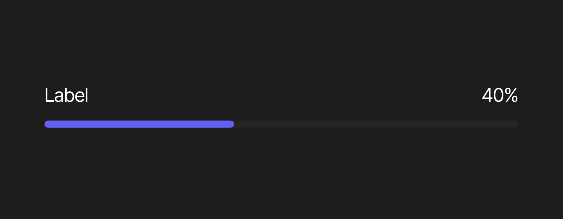
Viewmodels
LinearProgressVM
controlArtboardartboardDetermines which artboard is used to visualize the track and range.
labelArtboardartboardDetermines which component is used for the Label.
valueDisplayArtboardartboardDetermines which artboard is used to display the value.
valuenumberThe current progress, between minValue and maxValue.
minValuenumberThe lowest value of the component.
maxValuenumberThe highest value of the component.
indeterminatebooleanIndicates when the progress is unknown.
labelstringSpecifies the localized strings that identifies the component.
directionEnumDetermines the component's left-to-right alignment.
setToMinPressedtriggerFires to set value to minValue.
setToMaxPressedtriggerFires to set value to maxValue.
Hierarchical Structure
linear_progress_component
- Root - The Root of the component.
- TopRow - A Layout containing the Label and Value at either end.
- Label - A Layout containing the Label Artboard.
- A component instance of labelArtboard.
- Value - A Layout containing the Value Display Artboard.
- A component instance of valueDisplayArtboard.
- Label - A Layout containing the Label Artboard.
- Control - A Layout containing the Control Artboard.
- A component instance of controlArtboard.
- TopRow - A Layout containing the Label and Value at either end.
Animations
This component contains three sets of animations, each on its corresponding layer.
- Actions
- Idle - Waits for setToMinPressed or setToMaxPressed to fire.
- SetToMin - Sets value to minValue. Plays when setToMinPressed fires.
- SetToMax - Sets value to maxValue. Plays when setToMaxPressed fires.
- ValueDisplay
- ValueShown - Sets the opacity of Value to 100%. Plays if (indeterminate = false).
- ValueHidden - Sets the opacity of Value to 0%. Plays if (indeterminate = true).
- Direction
- DirectionLTR - Lays out the component from left to right. Plays if (direction = LTR).
- DirectionRTL - Mirrors Control and swaps the Label and Value. Plays if (direction = RTL).
progress_bar_control
- Track - The Root of the component. Fills the width it is given.
- IndeterminateRange - A Layout that sweeps across Track while the progress is unknown.
- Range - A Layout representing the filled part of Track. Its width is a percentage of Track, derived from value, minValue and maxValue, and eases to each new value.
Animations
This artboard contains three animations used in a corresponding state machine layer.
- State
- StateLoading - Indicates the task is in progress. Plays if (value < maxValue) and (indeterminate = false).
- StateComplete - Indicates the task is complete. Plays if (value ≥ maxValue) and (indeterminate = false).
- StateIndeterminate - Indicates the progress is unknown. Hides Range and loops IndeterminateRange across Track. Plays if (indeterminate = true).
text_label
- Root - The Root of the component.
- Text Layout - A Layout containing a Text Element.
- Text - A text element. The value of its Text Run is bound to label (LinearProgressVM).
- Text Layout - A Layout containing a Text Element.
text_value_display
- Root - The Root of the component.
- Text Layout - A Layout containing a Text Element.
- Text - A text element. The value of its first Text Run is the percentage derived from value (LinearProgressVM). Its second Text Run is a "%" sign.
- Text Layout - A Layout containing a Text Element.
Best Practices
- Drive the component through value, minValue and maxValue. The percentage is never stored: it is derived wherever it is needed, clamped between 0 and 100.
- Set indeterminate to true when the progress of a task cannot be measured, rather than animating value yourself.
- StateComplete looks the same as StateLoading by default. Restyle it in progress_bar_control if you want to indicate when a task is complete.
- Your styling might vary depending on the needs of your project. To accommodate this, create a new artboard bound to LinearProgressVM and set it as controlArtboard, labelArtboard or valueDisplayArtboard.