


Components
Steps
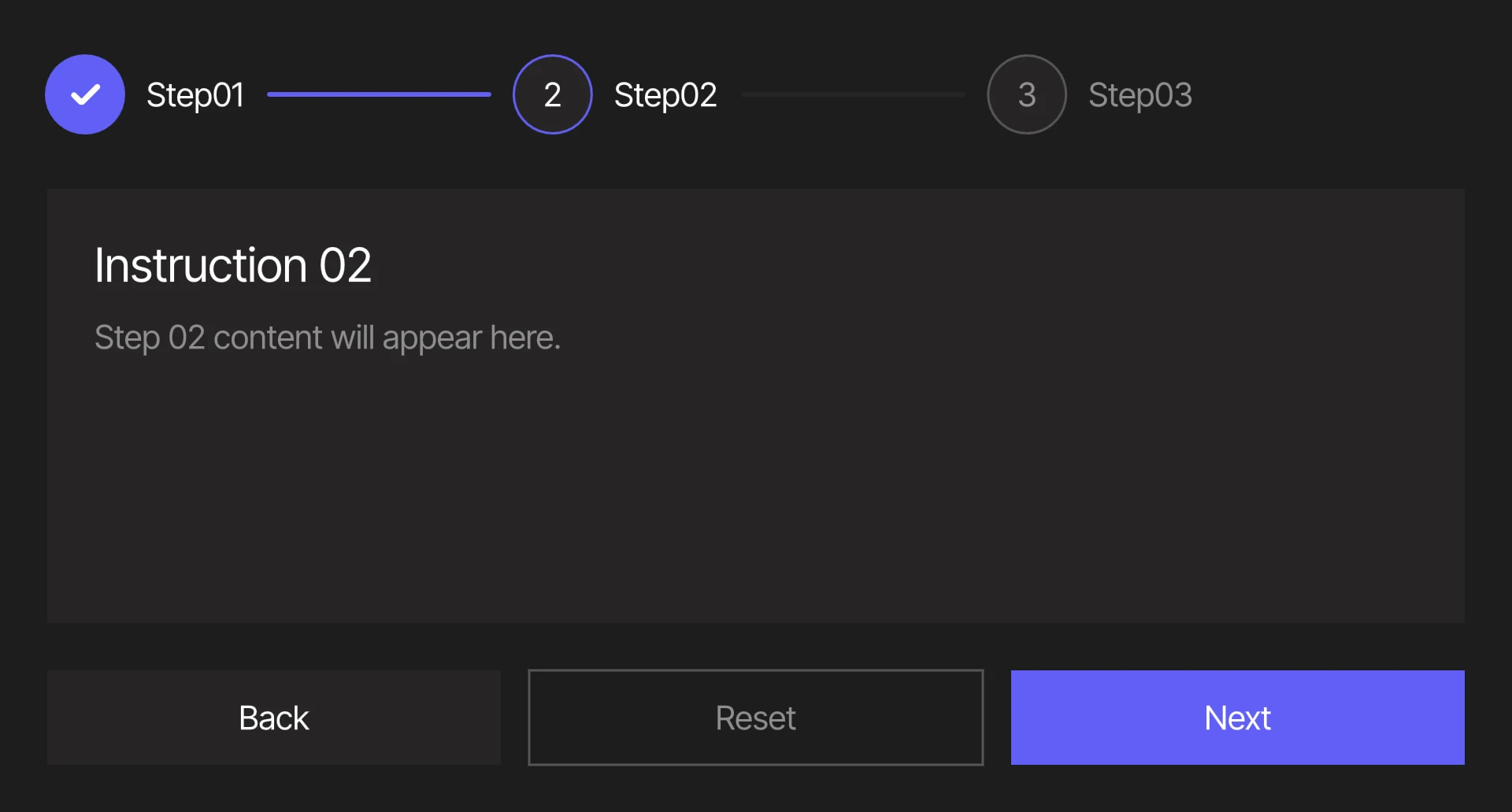
A component that guides users through a multi-step process, one step at a time.
Viewmodels
StepsVM
selectedItemIndexnumberThe index of the current step. Equals itemCount once every step has been completed.
itemCountnumberThe total number of items in steps.
linearbooleanDetermines whether steps must be completed in order. If (linear = true), steps after selectedItemIndex cannot be pressed.
stepslistContains a list of all steps in the component.
completedStepviewmodelA StepVM containing the content shown once every step has been completed.
nextPressedtriggerFires when the Next button has been pressed. Moves selectedItemIndex forward by one, up to itemCount.
prevPressedtriggerFires when the Back button has been pressed. Moves selectedItemIndex back by one, down to 0.
resetPressedtriggerFires when the Reset button has been pressed. Sets selectedItemIndex to 0.
labelstringSpecifies the localized strings that identifies the component.
prevLabelstringSpecifies the localized strings for the Back button.
resetLabelstringSpecifies the localized strings for the Reset button.
nextLabelstringSpecifies the localized strings for the Next button.
StepVM
listIndexnumberThe index of the item.
titlestringSpecifies the localized strings that identifies the step.
currentIndexnumberMirrors selectedItemIndex (StepsVM) through a two-way binding. Pressing a step writes its listIndex here, which updates selectedItemIndex.
linearbooleanMirrors linear (StepsVM).
hoverbooleanIndicates when the pointer overlaps with the step.
contentTitlestringSpecifies the localized strings for the title of the step's content.
contentBodystringSpecifies the localized strings for the body of the step's content.
Hierarchical Structure
steps_component
- Root - The Root of the component.
- Steps - A Layout containing the step items.
- An Artboard List of steps. The artboard in use is step_item.
- Content - A Layout containing step content.
- An Artboard List of steps. The artboard in use is step_content.
- CompletedSlot - A Layout containing the completed content.
- A component instance of step_content, bound to completedStep.
- Footer - A Layout containing the navigation buttons.
- BackButton - A Layout containing the Back label. Pressing it fires prevPressed.
- A component instance of text_prev_label.
- ResetButton - A Layout containing the Reset label. Pressing it fires resetPressed.
- A component instance of text_reset_label.
- NextButton - A Layout containing the Next label. Pressing it fires nextPressed.
- A component instance of text_next_label.
- BackButton - A Layout containing the Back label. Pressing it fires prevPressed.
- Steps - A Layout containing the step items.
Animations
This component contains three pairs of animations, each on its corresponding layer. A fourth layer, Navigation, updates selectedItemIndex when nextPressed, prevPressed or resetPressed fires.
- BackButton
- BackEnabled - Indicates the Back button can be interacted with. Plays if (selectedItemIndex > 0).
- BackDisabled - Indicates the Back button cannot be interacted with. Plays if (selectedItemIndex = 0).
- NextButton
- NextEnabled - Indicates the Next button can be interacted with. Plays if (selectedItemIndex < itemCount).
- NextDisabled - Indicates the Next button cannot be interacted with. Plays if (selectedItemIndex = itemCount).
- Completed
- CompletedShown - Sets the visibility of CompletedSlot to "Show." Plays if (selectedItemIndex = itemCount).
- CompletedHidden - Sets the visibility of CompletedSlot to "Hide." Plays if (selectedItemIndex < itemCount).
step_item
- Root - The Root of the component.
- Hit - A Layout covering the whole step. All pointer functionality targets this layout.
- Trigger - A Layout containing the step's Indicator and Title.
- Indicator - A circular Layout showing the step's status.
- CheckArt - A group containing two shapes that form a check mark.
- A component instance of text_step_number.
- A component instance of text_step_label.
- Indicator - A circular Layout showing the step's status.
- Separator - A Layout that connects the step to the next one.
- LastItemCheck - A script used as a transition condition. It returns true if (listIndex ≥ itemCount - 1), which hides Separator on the last step without needing a flag on each item.
Animations
This component contains four sets of animations, each on its corresponding layer.
- Status
- StatusIncomplete - Indicates the step has not been reached. Fades the number and title. Plays if (listIndex > currentIndex).
- StatusCurrent - Indicates the step is the current step. Highlights the Indicator's ring. Plays if (listIndex = currentIndex).
- StatusComplete - Indicates the step has been completed. Fills the Indicator, replaces the number with CheckArt and highlights Separator. Plays if (listIndex < currentIndex).
- Hover
- HoverTrue - Indicates the pointer overlaps with the step. Plays if (hover (StepVM) = true).
- HoverFalse - Indicates the pointer does not overlap with the step. Plays if (hover (StepVM) = false).
- Interaction
- Clickable - Indicates the step can be pressed. This animation plays under two conditions:
- If (linear = false).
- If (listIndex ≤ currentIndex).
- Locked - Moves Hit out of reach so the step cannot be pressed. Plays if (linear = true) and (listIndex > currentIndex).
- Clickable - Indicates the step can be pressed. This animation plays under two conditions:
- Separator
- SeparatorShown - Sets the opacity of Separator to 100%. Plays if LastItemCheck returns false.
- SeparatorHidden - Sets the opacity of Separator to 0%. Plays if LastItemCheck returns true.
step_content
- Root - The Root of the component.
- A component instance of text_content_title.
- A component instance of text_content.
Animations
This artboard contains a pair of animations used in a corresponding state machine layer.
- Selected
- SelectedTrue - Sets the visibility of the artboard to "Show," then fades and slides Root into place. Plays if (currentIndex = listIndex).
- SelectedFalse - Sets the visibility of the artboard to "Hide." Plays if (currentIndex ≠ listIndex).
text_step_number
- Root - The Root of the component.
- Text Layout - A Layout containing a Text Element.
- Text - A text element. The value of its Text Run is bound to listIndex (StepVM) + 1.
- Text Layout - A Layout containing a Text Element.
text_step_label
- Root - The Root of the component.
- Text Layout - A Layout containing a Text Element.
- Text - A text element. The value of its Text Run is bound to title (StepVM).
- Text Layout - A Layout containing a Text Element.
text_content_title
- Root - The Root of the component.
- Text Layout - A Layout containing a Text Element.
- Text - A text element. The value of its Text Run is bound to contentTitle (StepVM).
- Text Layout - A Layout containing a Text Element.
text_content
- Root - The Root of the component.
- Text Layout - A Layout containing a Text Element.
- Text - A text element. The value of its Text Run is bound to contentBody (StepVM).
- Text Layout - A Layout containing a Text Element.
text_prev_label
- Root - The Root of the component.
- Text Layout - A Layout containing a Text Element.
- Text - A text element. The value of its Text Run is bound to prevLabel (StepsVM).
- Text Layout - A Layout containing a Text Element.
text_reset_label
- Root - The Root of the component.
- Text Layout - A Layout containing a Text Element.
- Text - A text element. The value of its Text Run is bound to resetLabel (StepsVM).
- Text Layout - A Layout containing a Text Element.
text_next_label
- Root - The Root of the component.
- Text Layout - A Layout containing a Text Element.
- Text - A text element. The value of its Text Run is bound to nextLabel (StepsVM).
- Text Layout - A Layout containing a Text Element.
Best Practices
- If using this component on a platform without pointer input, you can fire nextPressed, prevPressed and resetPressed, or set selectedItemIndex directly, to navigate between steps.
- Keep itemCount equal to the number of items in steps. It decides when the Next button is disabled, when the completed content appears, and which step hides its Separator.
- Each StepVM holds both its step's title and its content, so adding a step only requires adding an item to steps. No extra wiring is needed.
- To restyle text, edit or replace the text artboards. Status styling lives in step_item, so the text artboards can be changed without breaking any logic.
- Your step contents might vary depending on the needs of your project. It is recommended to customize step_content rather than adjusting the layout settings of the Content layout in steps_component, since every panel shares the same space and only the selected one is shown.